
After searching the web to find several good and bad examples of website design, I finally settled on one specific website as my “bad website” example.
The website in question is the James Bond Museum in Sweden, their website URL is: www.007museum.com and a preview image can be seen below in case the website is unavailable.
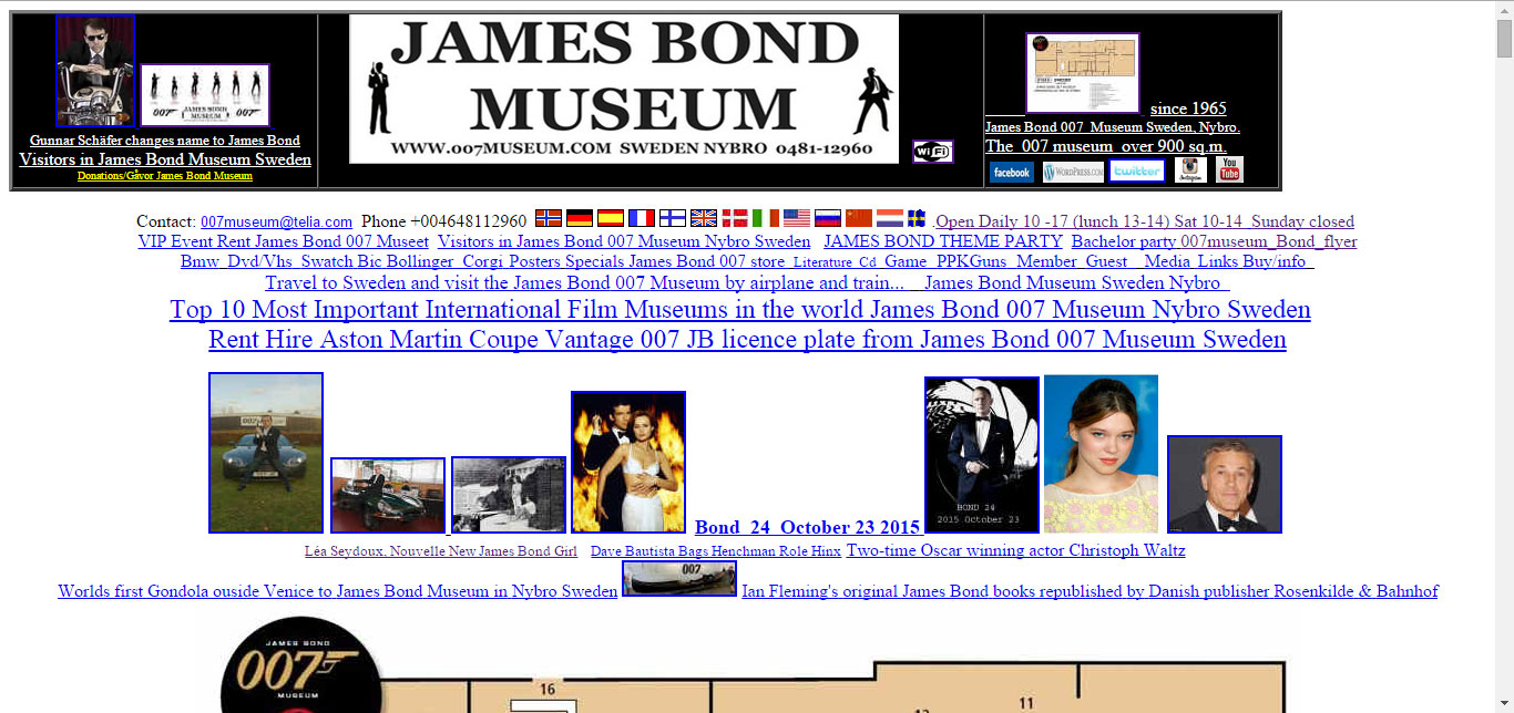
I chose this website over all other bad examples for a large number of reasons and I have listed them below.
They do not have any clear navigational menu on their website which would finding specific content (like opening times) rather difficult for any customer/visitor.
There is virtually no styling present and visually this makes for a very sparse website. Another issue with the lack of styling is that the content isn’t broken up into clear sections which, to the reader, makes the entire website appear as a great wall of text.
Putting myself in the shoes of a visitor browsing the website to find information about the museum I find myself struggling to differentiate the content on the website and find basic information like the address, images of the actual museum and museum information.
There appears to be no easy way of returning to the main homepage after clicking a link and several elements are styled in such a manner that it makes reading unpleasant.

In conclusion; this website could do with a major overhaul which is part of the reason I chose it for my redesign.