Task 3 – Produce a Website – FINAL PIECE

Standard

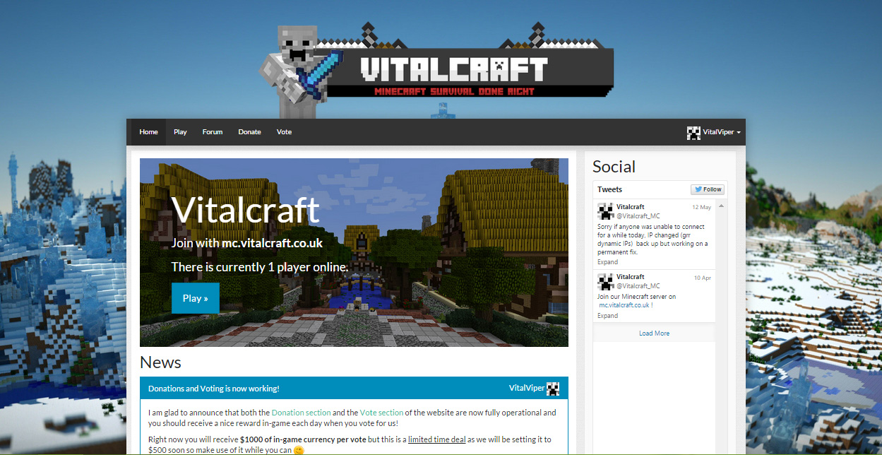
My final design for this project can be viewed below and the live website can be found using the link provided.

vitalcraft-homeLink: http://www.vitalcraft.co.uk


 Why Vitalcraft?

I decided on creating a community website for a Minecraft server that I own called Vitalcraft and host myself as this would be a great way to get a working and hopefully well built website for my server.

How was it done?

After researching for the best way to integrate Minecraft into your website and how to build a website tailored for Minecraft I came across a website system software called “Nameless MC” which seemed to provide exactly the kind of integration and features I was looking to have and it is built using bootstrap which was a massive bonus due to the inherent responsive style.

The software itself was built in php using bootstrap and it came with a variety of themes pre-configured.
I (of course) opted to build a tailored theme myself instead using CSS and code edits to accomplish my desired look and functionality.

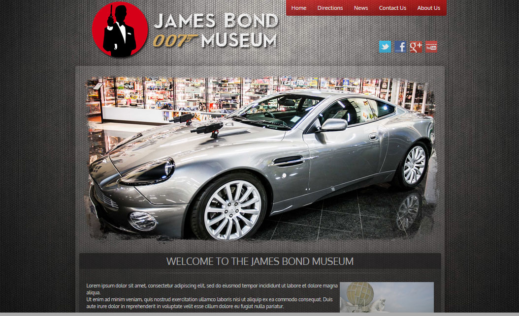
I decided I wanted it to be a visual styled website after researching various examples and seeing which elements I liked. I wanted to add a large background image from the start which meant that the design would need to be placed within a container.

After experimenting with a lot of different implementations I created the style and logo (not including a lot of tweaks) that can be seen on the live site and the screenshot above.

The logo itself was created using Photoshop and features a cutout of the main character for the server to the left.

The websites CMS included a forum which I activated and populated with posts/categories and Social media integration was added by embedding the Twitter feed onto the homepage.

Final thoughts / reflection

Overall I am quite happy with how it turned out in the end, although, due to my perfectionists ways I feel like I will never finish tweaking the website until the unfortunate day that Vitalcraft ceases to exists.

Thanks for taking the time to read this post, please feel free to leave a comment below.

Task 1 – Platforms for mobile sites

Standard

There are two standard options for creating a mobile website, one being a separate website that only shows for mobile browsers and the other being making your existing website responsive.

There are benefits to both, so it can be difficult to decide whether you want to build a separate site or modify your current site to be responsive.

Separate website:

A separate website has some advantages although currently responsive is gaining more and more popularity due to how versatile it is to create and use.

One reason to choose a separate site for mobile visitors would be that it is built from the ground up to be compatible with most major mobile browsers and operating systems which in turn guarantees compatibility and ensures that buttons, banners and text is easily legible when viewed on a small screen.

As it is a separate mobile site it also means that the code is optimized to be as light in footprint as possible and pages tend to load quicker if you are browsing using a mobile network as you do not need to load the entire desktop site.

A separate site for mobile would normally however require more maintenance and upkeep as content won’t automatically match that of your main website.

Responsive Design:

The main benefit from choosing a responsive design is that it will automatically adjust/scale to the resolution and device that your visitors are browsing with which will always provide them with a similar experience to visitors browsing on a desktop computer as no content is changed but merely adapted to fit.

Another benefit is that your website will have a single URL as sometimes mobile sites are hosted separately and therefore will need to be marketed and optimized in terms of SEO seperately as well.

Responsive sites are usually also cheaper to build depending on if your main website is compatible and responsiveness is added into the design from the start.

What to choose in 2015?

Ultimately I personally would always opt for a responsive way to deal with mobile visitors as it just offers so many benefits in terms of SEO and simplicity that this definitely seems to be the way forward.

Responsive also seems to be gaining more and more popularity and nowadays some of the issues such as legibility have been entirely solved by correct styling depending on the amount of pixels in your browser window and the usage of Bootstrap among other ways to create a website.

Workshop 1: Embedding slider using jQuery

Standard

In this task we were shown how to add a sliding banner using either images, text or a combination of both.

We used the “Anythingslider” script with the default tutorial images and slides.

First we created a new blank project and once this was up and running we copied in the javascript, styles and images into the project folder.
We then added the scripts and styles to the header as can be seen in the screenshot below

adding-code

After this we copied over the html for the slider itself into the page and when viewed in the browser it worked exactly as expected.

sliding-jquery

Website production – My final design

Standard

After a lot of thought, I decided to create a design for a Hot Air balloon events website as this seemed like an interesting subject that would leave me with a lot of room for experimentation both in terms of style and imagery.

My first step was researching the design style I wanted to use for my website and eventually I settled on going for a flat design style across one page with different sections for all content.
I opted for this style as I am a big fan of the newer sleek and professional looking websites that are currently out there such as Twitter, eBay, Instagram and many others.
I also thought a one page informational site would most likely be sufficient for a website dedicated to an event.

After the research phase I started by creating the logo in Photoshop which I based off of several examples I was able to find using Google Images.

The final logo can be viewed below:

The logo text went through several design revisions as I changed font and colors but eventually I decided on a two-tone shade of purple for the text as this played well with the existing colors.

I used several scripts in my website/project to add smooth anchor scrolling, rotating banner images and a “back to top” button as well as a functional gallery.

My final live design can be viewed by clicking the link below the screenshot.

hot-air-balloon-sample


Link: https://www.jorian.co.uk/citycollege/balloon-site/

Website Production: Target Audience Analysis

Standard

In this task I was asked to perform an Analysis of the target audience for my “Hot air Balloon events” website,

I have written my answers to the various questions that were asked below;

    • What age? – The age of the visitors to this website would vary wildly from anywhere between the ages of 18-75 although most likely it will be more focused on middle-aged people as Hot air ballooning
      isn’t yet a thing all the kids rave about!
  •  What Technical Ability? – I reckon it is best to keep the website simple yet very informative in order to appeal to the largest audience possible and to cater for those that are not very computer literate.
  • What kind of Interests would your visitors have? (Newspapers, Magazines etc.) – I think most visitors to this particular website would be interested in Nature shows and magazines and perhaps outdoor activity related articles. I would image people that like Hot air Ballooning to be adventurous which is why i think a colorful and graphical website would work well.

Workshop: Embedding a Contact form

Standard

This week we looked at creating and embedding a contact form within a website in dreamweaver by using an external script.

We started by creating a new project using the defautl template in html5 and after we were provided with the script to use (ProcessForm from mindpalette.com)

The first thing that needed to be done was to open and edit the php file included to change the email address that the script uses to send the form-text to.
An example of where to change this can be seen in the screenshot below.

processform_screenshot


After this we created the form within dreamweaver using the “insert -> form” menu.
There are several different options to choose from and you can choose between a form that validates its entry and one that accepts any kind of input.

My form can be seen below and it features a text area, email address field, checkbox option and dropdown selection.

contact-form

The page can also be viewed here: /form-design/ (although I would appreciate it if spam was kept to a minimum ☺)

Workshop 3: Basic page Linking and anchors in Dreamwaver

Standard

In this workshop we were given the the task of creating various types of links within a new Dreamwaver project and successfully inserting a script into one of the pages to smoothly scroll between sections of text.

We started with a single index page after selecting the right folder to use within Dreamweaver and we then added a logo image and text/images to the page.

index-page

After this was done we created two additional pages and we linked them to each other by means of the navigational menu at the left hand side.

After linking the pages we were taught (well.. I must admit I did not learn anything new here) to add a hyperlink to an off-site and on-site page and finally how to add a script reference to the <head> of the page. Once the script was linked we started creating anchors for several headings on the page with a link to them at the top which (by means of the aforementioned script) smoothly scrolled to each section.

anchor-text


The whole project can be viewed in its final form at: /project-3/

Final Interface Designs (3)

Standard

textured-designLive link: textured-design


flat-design

Live link: flat-design

visual-design

Live link: visual-design

My final designs for this project can be seen above or you can visit the live links listed below each image to view the website fully.

All my designs were built from scratch using a template I built during a previous project and edited in HTML/CSS using notepad++

 I chose to redesign the James Bond Museum website in Sweden which I have also reviewed as par of the Bad website Review for this project; their current website was very cluttered and lacks any styling which left ample room for imagination in my designs.

First Design; Textured

The first design I did was the Textured one, I started by looking at other museum websites for inspiration although none really fitted the atmosphere that a James Bond website should have.

After browsing around and sourcing several texture based images I created the website and positioned all elements within the source code as a base for my design.

Afterwards I applied a suitable website background image and I created the logo in Photoshop, I then decided to create a rotating banner on the homepage as this would add a dynamic element to the website. The images for the banner were edited by deleting the edges with a rough brush to create a textured “grunge” style look.

Second Design: Flat

The second design is one I liked most myself due to the (semi) professional look and the clean and modern feel.

Again I started by sourcing images to use as well as visiting several websites that were using a flat style for inspiration.
I edited the code-base for my website from the previous design to be full-width and dynamically scaling and created several divs within the container for the content (this was surprisingly very difficult/time consuming to code and get right).

I then created the logo and positioned it at the top together with the navigation and social media icons.
The rotating banner script was also amended to work full width and I positioned a div on top of it to display the “welcome” text for the website.

Finally I styled each div individually and added text and an image to fill in some of the site’s information, I didn’t manage to copy any of the existing text as everything is in Swedish on their website which does make the homepage look a bit sparse.

Third Design: Visual?

I’m not too sure what to call this style so I chose for “Visual” as there is a lot of imagery which I thought would suit.

For this design I decided to create a more visually engaging website which focuses on Simplicity, I started off by again modifying the template I used before to create several divs to house the images I was planning on using.

I kept the background to a plain white color as this made the images pop out and provided a clean and professional look.

The rotating banner was once again included although I chose to overlay text onto the images in this instance and use it as a main announcement section for this style.

Workshop 2: Writing HTML

Standard
<!DOCTYPE html PUBLIC "-//W3C//DTD XHTML 1.0 Strict//EN" "http://www.w3.org/TR/xhtml1/DTD/xhtml1-strict.dtd">
<html xmlns="http://www.w3.org/1999/xhtml">
<head>
<title>Example Html page</title>
<meta http-equiv="Content-Type" content="text/html; charset=utf-8" />
</head>
<body>
<h1>Heading One</h1>
<p>This is some text</p>
<img src="/image-path/image.jpg" alt="Alt image">
<p><a href="mailto:test@test.co.uk">test@test.co.uk</a></p>
<p><a href="http://www.google.co.uk" target="_blank">GO to our new website</a></p>
</body>
</html>

Seems self explanatory? 🙂

Workshop 1: Looking at the Code

Standard

We were given the task of looking at the source code of a website to identify and familiarize ourselves with the various elements that make up a page.

I chose Dafont.com and the following are a few questions that were asked:

Body section of code

Is the site using tables or divs? Divs
Is the site using h1 and h2 heading tags? yes
Is the site using alt tags for images? yes
Is the site using descriptive folder/file names? yes

html-type


alt-text