Final Interface Designs (3)

Standard

textured-designLive link: textured-design


flat-design

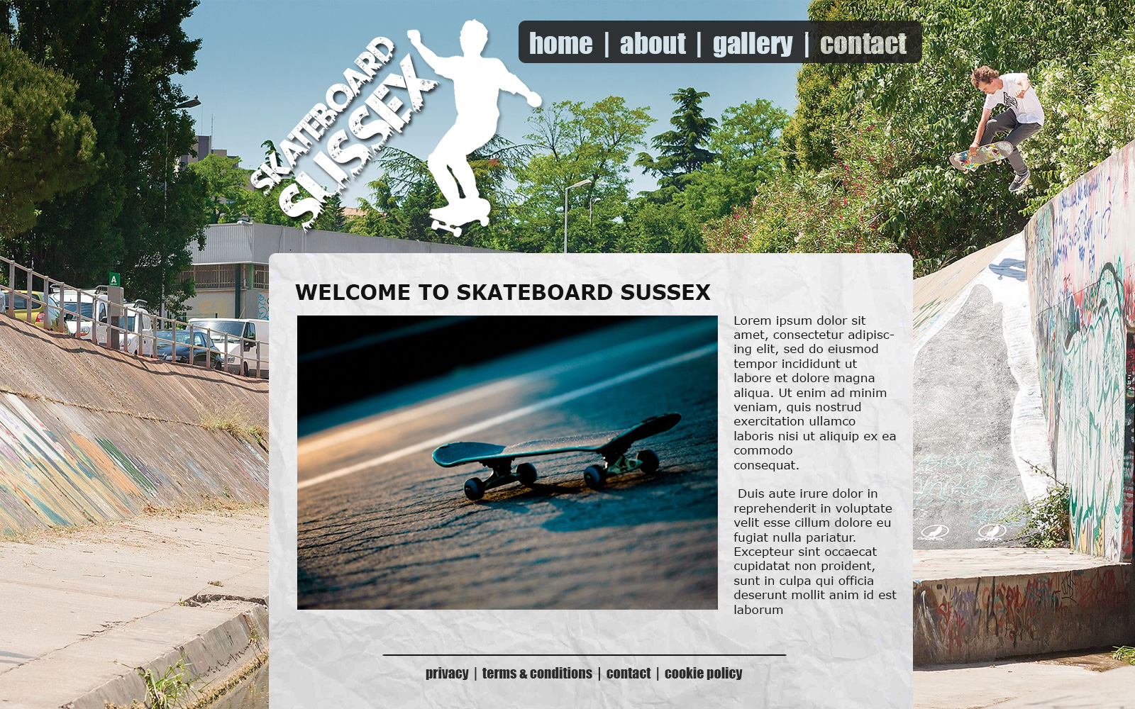
Live link: flat-design

visual-design

Live link: visual-design

My final designs for this project can be seen above or you can visit the live links listed below each image to view the website fully.

All my designs were built from scratch using a template I built during a previous project and edited in HTML/CSS using notepad++

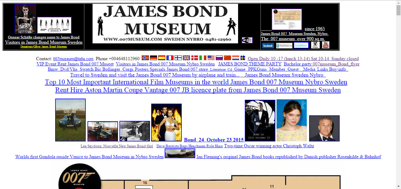
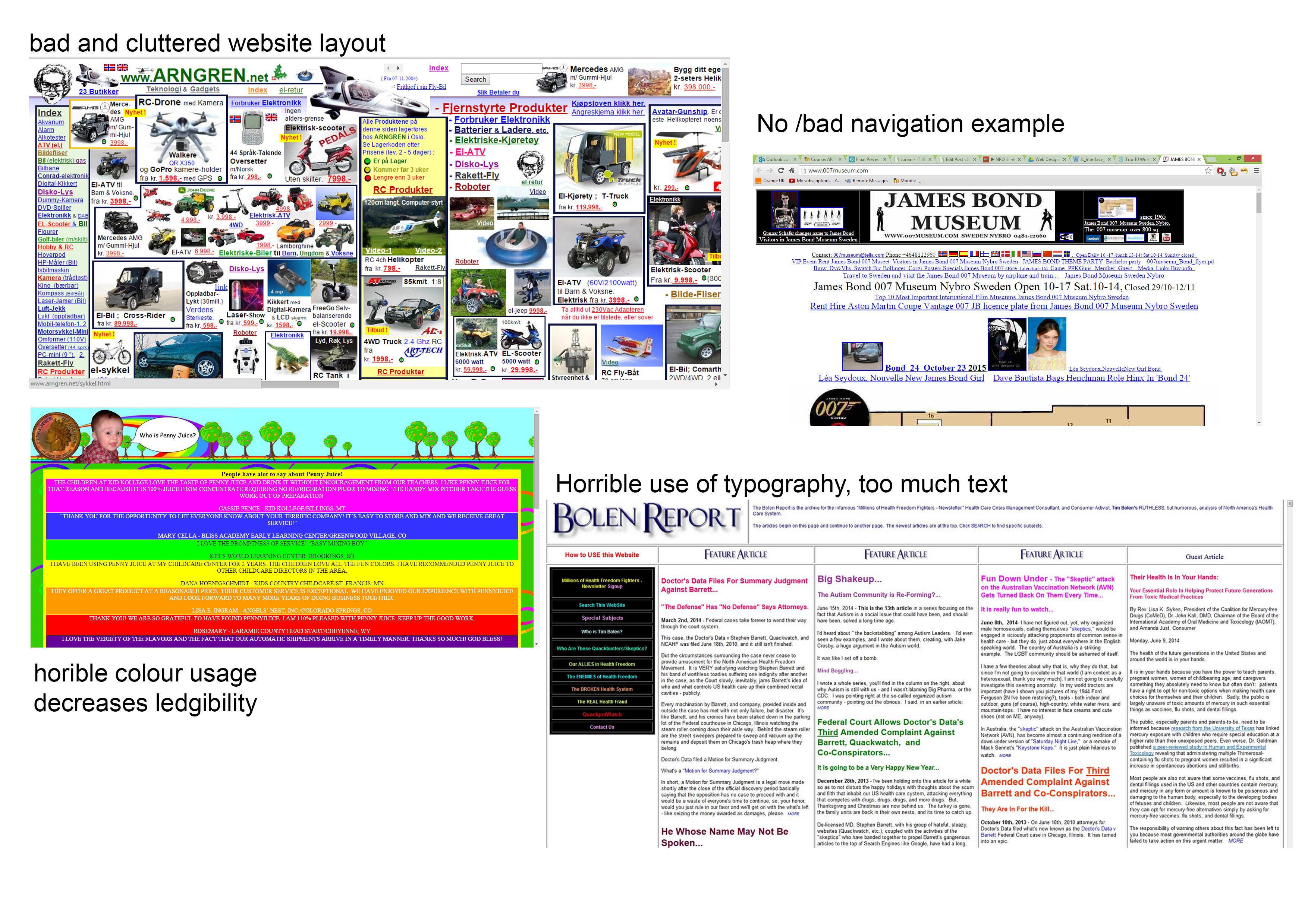
 I chose to redesign the James Bond Museum website in Sweden which I have also reviewed as par of the Bad website Review for this project; their current website was very cluttered and lacks any styling which left ample room for imagination in my designs.

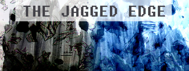
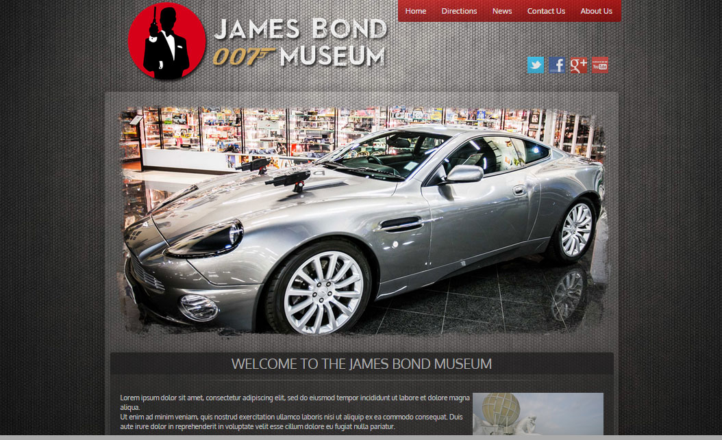
First Design; Textured

The first design I did was the Textured one, I started by looking at other museum websites for inspiration although none really fitted the atmosphere that a James Bond website should have.

After browsing around and sourcing several texture based images I created the website and positioned all elements within the source code as a base for my design.

Afterwards I applied a suitable website background image and I created the logo in Photoshop, I then decided to create a rotating banner on the homepage as this would add a dynamic element to the website. The images for the banner were edited by deleting the edges with a rough brush to create a textured “grunge” style look.
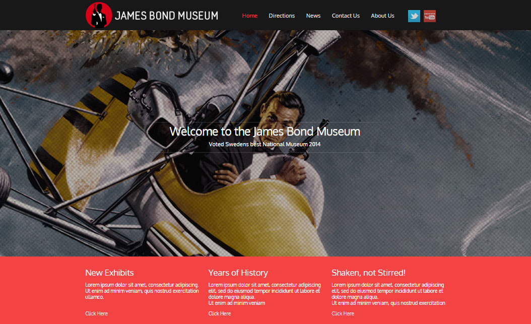
Second Design: Flat

The second design is one I liked most myself due to the (semi) professional look and the clean and modern feel.

Again I started by sourcing images to use as well as visiting several websites that were using a flat style for inspiration.
I edited the code-base for my website from the previous design to be full-width and dynamically scaling and created several divs within the container for the content (this was surprisingly very difficult/time consuming to code and get right).

I then created the logo and positioned it at the top together with the navigation and social media icons.
The rotating banner script was also amended to work full width and I positioned a div on top of it to display the “welcome” text for the website.

Finally I styled each div individually and added text and an image to fill in some of the site’s information, I didn’t manage to copy any of the existing text as everything is in Swedish on their website which does make the homepage look a bit sparse.

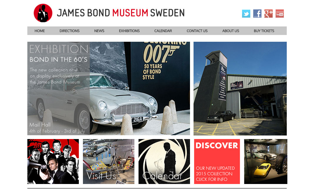
Third Design: Visual?

I’m not too sure what to call this style so I chose for “Visual” as there is a lot of imagery which I thought would suit.

For this design I decided to create a more visually engaging website which focuses on Simplicity, I started off by again modifying the template I used before to create several divs to house the images I was planning on using.

I kept the background to a plain white color as this made the images pop out and provided a clean and professional look.

The rotating banner was once again included although I chose to overlay text onto the images in this instance and use it as a main announcement section for this style.

Good website Evaluation

Standard

After exploring many website I decided to review/evaluate the bbc.co.uk main website as I found it to be exceptionally good in terms of navigation and clear structured information that was presented to me.

bbc-website


The reasons I chose this website as my “Good website” example are listed below;

Navigation:

The navigation used throughout the website is clear and as a visitor I was never confused where I was on the website or how to return to the main areas of interest, the navigation is visible and accessible both at the top and bottom of the website although they are different in layout as the top navigation is more condensed.

Furthermore I found the use of expandable menus to feel very natural and I like that the main sections of the website are style differently which makes it immediately clear where you are.

Styling:

The styling of the website differs for each section as mentioned above and I found it to be very pleasing on the eye overall. There is not too much going on in therms of graphics and the design itself is very clean.

I love the rotating banner style news and highlights on the homepage which show the latest for each section as well.


In conclusion I think BBC has done a great job developing and designing their website and I am sure many thousands of pounds were spent creating this, I have tried using certain elements in my designs as well although nowhere near as sophisticated.

Bad Website Evaluation

Standard

After searching the web to find several good and bad examples of website design, I finally settled on one specific website as my “bad website” example.

The website in question is the James Bond Museum in Sweden, their website URL is: www.007museum.com and a preview image can be seen below in case the website is unavailable.

james-bond-original

I chose this website over all other bad examples for a large number of reasons and I have listed them below.

They do not have any clear navigational menu on their website which would finding specific content (like opening times) rather difficult for any customer/visitor.

There is virtually no styling present and visually this makes for a very sparse website. Another issue with the lack of styling is that the content isn’t broken up into clear sections which, to the reader, makes the entire website appear as a great wall of text.

Putting myself in the shoes of a visitor browsing the website to find information about the museum I find myself struggling to differentiate the content on the website and find basic information like the address, images of the actual museum and museum information.
There appears to be no easy way of returning to the main homepage after clicking a link and several elements are styled in such a manner that it makes reading unpleasant.

unpleasant

In conclusion; this website could do with a major overhaul which is part of the reason I chose it for my redesign.

Skateboard Sussex workshop

Standard

In this task we were asked to create a website layout/mock-up for a website for “Skateboard Sussex” to get familiarized with the principles of Interface design and the ability to create layouts using Photoshop.

After browsing to select suitable images I started and created a new project within Photoshop given the correct dimensions of 1600×1000 pixels.

A lot of experimentation and different ideas brought me to the final Workshop design as seen below which incorporates a lot of elements I would expect to see on a grunge type Skateboarding website.
I chose a wallpaper to span the entire width of the website which seemed to work best given my choice of design, I added a navigator and footer to the website and a main container to hold the content such as a hero image and text

The logo was created using a grunge type font that was rotated and a cutout of a skateboarder that was vectored and coloured in.

skateboard-sussex-workshop


Workshop 1. Create a header graphic for 2 blogs

Standard

We were tasked with creating two headers using images blended together to create textures.

The two I chose were “Hysteria Blog” and “The Jagged Edge”

For the first header I chose as many erratic and out of control images as possible to merge them together in one hysterical image. My result can be viewed below

hysteria-blog

The second header was made using images for search terms such as “sharp rocks” and “glass shards” which resulted in the image below after being blended, I chose a suitable font which has edges to finalize the header.

the-jagged-edge

To see screenshots of these headers in development in Photoshop, please click on one of the images below


edge-photoshop   hysteria-photoshop

Illustrator Practice

Standard

After a tutorial in class we were tasked with re-creating a simple logo within Adobe Illustrator

I chose to replicate the logos shown below, the originals are included on the right.

logo-illustrator

Webdings Logo Creation

Standard

After being introduced to logo creation and branding we were tasked with creating a logo made from a webding font combined with regular text

The company name that I created the draft logo for  was EyeScan so I opted for a circular shape as this would work well to show the eye within.

webdings-sample webdings-sample-screenshot

Interface Design Workshops

Standard

We were tasked with researching and creating a mood-board containing several elements that make up a website to provide examples as well as to provide examples of what makes a bad website “bad”.

Workshop 1

The image below demonstrates the elements that make up most websitesmoodboard-1-elements

Workshop 2

The image below showcases several bad design choices and issues with websites

Moodboard-2-examples